A JOURNEY INTO COVER ARTWORK
This feature originally appeared in LODOWN MAGAZINE #55 Feb/March 2007
Being a music afficiando all my life, there certainly is something almost fetish-like about the pleasure of holding a designed object in my hands, representing a true bond of two very distinct and different types of media, music and art. Despite several format changes from LP to Cassette to CD, it is an outlet for experimentation, art, fun, social comment, or just the power of the visual image to sell, promote or present music.
This feature is dedicated to record sleeves, a celebration of the quadratic art. A record unites two different kinds of artists, the designer and the musician. It offers the opportunity to create a visual to represent a non-visual art. Being a graphic designer, taking care of the artwork for a forthcoming record could be like getting a nice big piece of cake... designing the booklet, the inlay, and the label, the CD itself could be its own piece of art if ideas are executed in an interesting way, which in the end is appreciated by the fan/costumer who’s eventually getting sucked into the whole thing while studying the lyrics of his favourite band religously.
Through the history of album design, there have been graphic-engineers and illustrators whose creations have become as famous as the labels or musicians they’ve worked with/for. Think of Designers Republic, Ben Drury, Pushead, Eh? or Haze, just to name a few that left their mark over the last years. In the 80s and 90s, it was Peter Saville’s work for bands like Joy Division or New Order that clearly stood out from the very majority. In the 60s and 70s Gary Burden, who’s still designing covers today, and photographer Henry Diltz, who brilliantly captured guys like Neil Young, The Eagles or The Doors on film, were making a difference... not to forget Roger Dean and his work for Yes and Storm Thorgerson visualizing Pink Floyd’s proggy compositions. The list goes on and on.
When I look at my personal favourites, I definitely have to mention Vincent Locke and his works for Cannibal Corpse. Their ‘Butchered at Birth’ album for example, left a permanent impression on me. The same can be said about the legendary Iron Maiden artwork, or the entire Slayer cover collection.
So, what is it like to be a cover designer? Are designers still experiencing a total free creative process? Lodown talked to illustrators and graphic-designers that work(ed) with Major labels and rather small Indies about the meaning and pleasure of record cover designs, about heroes and favourites and which albums of the past made them want to giving it a try in the first place. How much involved are today’s musicians in the design process, and is it a good thing or not? Most of them have ideas by themselves. Or friends who call themselves designers. Or they own Photoshop and Freehand by themselves. Most of the labels today allow their artist-roster to create or approve the artwork for their covers, some of the artists take this more seriously than others. Statistics say that singer/songwriters seem to care the most, followed closely by young Rock bands while questionable popstars seem to be mostly concerned about clothing, hair and make-up. In general, (Mainstream) Pop, Rock and HipHop musicians tend to get very involved, maybe because of the commercial-driven character of their weapon of choice.
But make no mistake, if things turn out right, it’s still up to the designer and his ideas in the end, delivering something unique that you just have to buy, take home, unwrapp and study while you nervously listen to the latest offering of your band du jour.
Anyway, on the following pages you’ll find ten artists, Lodown fellows and illustrators we love and respect, with covers they did by themselves, designers they adore, and artwork they were heavily influenced by... enjoy.
Christoph J. Rambow
HAZE
Jimi Hendrix “Are You Experienced”
art director: Ed Thrasher / Warner Bros.
long before hip hop style came of age and redefined our sensabilities, this was the album and cover that started it all for me. with a psychedelic fish eye photo that perfectly captured jimi’s revolutionary style, and the extra groovy freestyle hand lettering... this was the one that got me open in 1972. ( *and yes, I took my name from it too, one very stoned young night. )
on his own works: LL Cool J “Bad”
this cover was the first one I was given complete responsibility for as both the designer and art director by Def Jam / CBS. at our first meeting, LL was trying to get me to do some graffiti styles for it, but I convinced him to do something cleaner and harder, so it didn’t look like just another “breakbeat” cover... when I finally showed him the first printers proof of the finished artwork, he gave it what I considered the ultimate B-Boy compliment, saying “Yo, that shit look like getting paid! “ and it turned out he was right... “Bigger And Deffer” went on to become the first ever “Rap” album to go platinum at the time.
TONE LOC “Loce’d After Dark”
this blue tinted version of the cover from my archive photo of the first printers proof was actually changed to black and white at the last minute by the record label, who was afraid it would make him look “too soft”... regardless, thanks to heavy rotation of the “wild thing” video on MTV,
“Loc’ed after dark” went on to become the first ever “rap” album to go #1 on both the rap and pop charts at the same time.
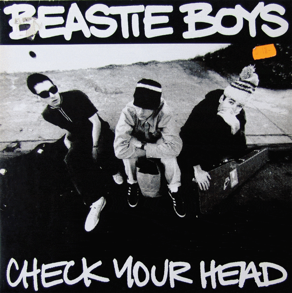
Beastie Boys “Check Your Head”
after months of trying out different ideas that the Beastie Boys had, less finally became more as we went for a very basic black and white cover treatment... MCA said to me that he wanted the album “ to sound like it was recorded on a toaster oven”, so I took that cue to go really rough and lo-fi with the layout and type treatment, too... even running glenn friedman’s photo through my fax machine first before printing it for the 12” cover. I also made a point of developing the type so it would work independently from the cover as a long term logo for the group, including merchandising and other uses... so it was especially cool to see just how far and wide this style ended up reaching, and how well it appears to still stand up to the test of time.


JEFF JANK
The Beatles “Revolver”
art director: Klaus Voormann
The cover of ‘Revolver’ was done by Klaus Voorman, a guy who pops up again and again in Beatles history. He was one of the dudes that gave them their faggy haircut back in their early German days, played bass on the solo Lennon albums, then did the cover for the Beatles anthologies in the 90s. More recently he was my neighbor – unfortunately I didn’t know until he had moved out. ‘Revolver’ is one of those covers that has been seen so many times that it’s easy to forget about it – but it still looks unusual today, and to the people who saw it amongst the conservative covers of 1966, it must have looked like madness. It’s a wild mess of hair and a disorienting mix of drawing and collage, and all skillfully composed. The detail I love most is that Voorman drew himself into the cover, between a few strands of George’s hair.
Schooly D “dto”
art director: Schooly D
Schoolly’s cover on the other hand is is basic, naïve, pure magic. You see a big block of yellow paper and hand-drawn cartoons, completely disorderly, like they’re drawn on the desk of a school kid – all of them about how cool Schoolly D is of course. This is raw and perfectly fitting for the album. The joint was drawn by Schoolly D himself. The back cover says, “Raps by Schoolly D. Drum programming by Schoolly D. Mixing by Schoolly D. Cover by Schoolly D” etc etc.
on his own works: Koushik “One In A Day” (2004)
Koushik’s presence in his own music is so low-key he’s almost invisible. B Plus took the photo. We listened to the record about six times that night, then drank some tequila, painted the street, then broke into an abandoned office building and shoot from the top.
Madvillain “Madvillainy” (2004)
I don’t know what it says about my stuff that my favorite cover is my most basic one, containing just one black & white photo (that I didn’t shoot) and a block of orange. The rapper, MF DOOM, had never been on a record cover before. A few other people that worked with him seemed to focus on the object of the mask itself, or his connection with the comic character Dr. Doom, but neither of those approaches interested me much. What I like is that this guy wears this weird metal mask, ALL THE TIME. Think about it, it just ain’t healthy! When I was a little kid I remember looking through my dad’s records and being scared by King Crimson’s ‘Court of the King Crimson’. So that’s what I sought to do with this record – a photo of a scary guy with a metal face that will hopefully give a 5 year-old a nightmare.
MF Doom “MM Food” (2005)
Ok, so I didn’t really do this cover myself, but I was the coach. Doom asked me to do his solo joint for Rhymesayers, and I immediately thought of my friend Jason Jagel, a painter in San Francisco. Jason has great taste in music and draws huge, dense pictures with interweaving words and stories – and he’s a Doom fan. I called him and asked him if he’d be interested in working on this cover with me, and I think he’d already begun before I hung up the phone. All I said was “make it simple, very very simple.” he called me back about 12 hours later and said he was finished - I don’t know how he did it. The painting does look fairly simple from a distance, but if you get in close you can see details that he painted with single strands of hair. The teeth are painted with gold foil, and one thing we had to remove from the cover is a giant blunt that Doom is smoking. Doom said, “yo, gotta lose the blunt – I’m a family man!”


GEOFF MC FETRIDGE
UB40 “Signing Off”
ODB “Return to the 36 Chambers Dirty” Version
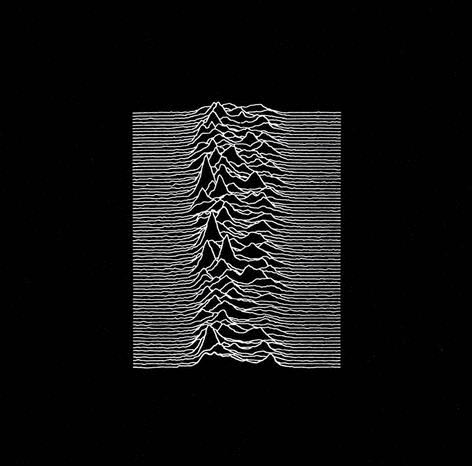
Joy Division “Unknown Pleasures” (single)
FRENCH
Obituary “Cause Of Death”
art director: Michael R. Whelan
For a start it was painted, and all the best metal artwork is painted. The eye and the horns and the skulls and the tree made of tormented faces is amazing. My brother had a leather jacket with it on the back when I was kid and I used to just sit and stair at it. I loved it. The person hanging from the tree really looks like its struggling to get out. The colours are really great, the reds all go together, the Obituary logo is a total classic as well. So good!
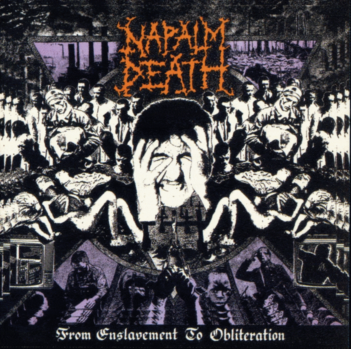
Napalm Death
“From Enslavement To Obliteration”
art director: Mark Sikora
Napalm Death “From Enslavement To Obliteration” has a really close place to my heart when it comes to albums and art work. It was the 1st “death metal” album I bought... instead of thrash. The art work, by Mark Sikora, who also did the cover for the 1st “Death” EP, is fucking mental. The layout is so good with all the dead bodies form concentration camps, workers, miltary and the guy holding his head in the centre. It’s so 80’s but so before anyone else got that good at gnarly artwork... and the three colour print makes it amazing. I recently got the t-shirt for Christmas after wanting it since 1990 when I first heard the record. I bought it on tape, but got it again on picture disk just for the art work.
on cover artists:
In terms of who’s killing it now, well, Chris Moyen is the man of the day for black / death bands really. He’s fucking amazing! More goats and satanic images than you can throw a burning bible at. He’s been doing it for a while but stuff like the new Archgoat album and the recent work for Proclamation is sick. Really, to have a made it as a decent worthy band you have to have Moyen do your art work. He’s worked with the greats, Blasphemy, Archgoat, Beherit, Incantation, Mortician... I don’t need to go on, just look him up on the web.
The other guy who is fucking sick is Wes Benscoter, he does a lot of the airbrush work for Mortician and other death metal bands. I really like the art work for Mortician’s “Chainsaw Dismemberment”, it’s so good.... with the dude in the door way as the women lyes screaming tide to the post with her leg sawed off. It’s what more albums should have.
STEFAN MARX
Sonic Youth “Goo”
art director: Raymond Pettibon
I do have many favourite record sleeves, new ones and the real classics. When I have to choose one I often name an old one. This time it’s Raymond Pettibon for Sonic Youth’s ‘Goo’. I love the drawing, then the small text which tells us a story... insane romantic! Beside the cover the music is amazing. Both fits together really good.
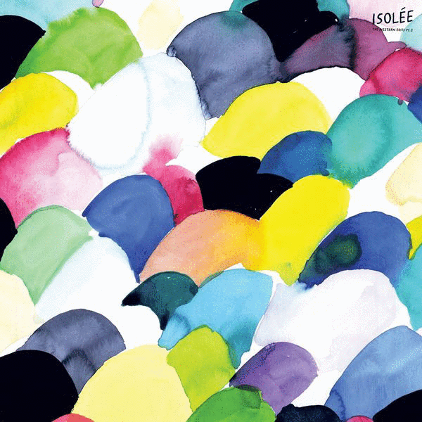
own works: Isolée “Western Edits pt. 2:”
I was really into watercoloring these days while listening to Isolée’s Western Store Compilation. The Edit Cover was straight from this period editing all on a sheet of paper... the cover shows a part of it. The original artwork is 700 mm to 1000mm and is now in property of Ata Macias.
Smallville “02”
I painted this oil color canvas and I thought it fits perfect on Denis Karimanis music. All Smallville releases will have my work on the record covers, they aren’t connected at first line to the artists music, the listener has to connect it.
PUSHEAD
Yes “Relayer”
art director: Roger Dean
From the first time I saw Roger Dean’s work, I was hooked. The unique combination of a well executed lettering style with an atmospheric landscape of details and colors, was what a cover should be... something you continually picked up to look at again and again. I enjoy the majority of his work, from..
Yes “Close to the Edge”, “Tales From Topographic Oceans”, “Yessongs” / Uriah Heep “Demons and Wizards”, “The Magician’s Birthday” / Badger “One Live Badger” / Gentle Giant “Octopus”... to one of his recent covers for Glasshammer “The Inconsolable Secret”
Roger Dean is perhaps my favorite cover artist. His covers were the source for me to try my hand in this field. It was not only his art, but also his lettering which is so strong and distinctive. The “Relayer” cover is probably my most favorite cover, though.


MAROK
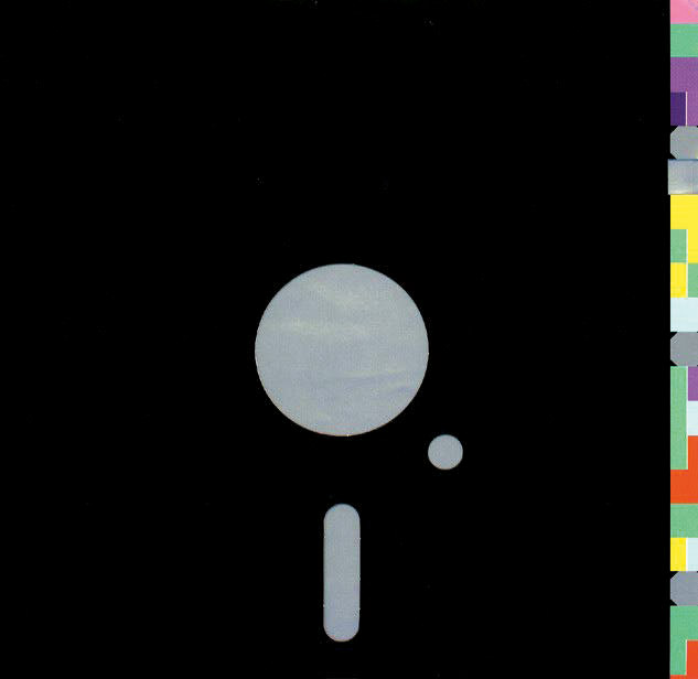
New Order “Blue Monday”
art director: Peter Saville and Brett Wickens (1983)
I think Peter Saville’s cover work is the most appealing to me. for the reason of simplicity and expressiveness. Born in Manchester in 1955, Saville decided to study graphics at Manchester Polytechnic. At the time Saville was obsessed with bands like Kraftwerk and Roxy Music. His design approach instead led him to discover the work of early modern movement typographers such as Herbert Bayer and Jan Tschichold. He found their elegantly ordered aesthetic more appealing than the anarchic style of punk graphics. Tschichold was the inspiration for Saville’s first commercial project, the 1978 launch poster for The Factory, a club night run by local TV journalist Tony Wilson whom he had met at a Patti Smith gig. Saville was soon the Designer of Factory Records and created its unique style. Having drawn on early modernist symbolism in the late 1970s, Saville turned to classical art historical references by the early 1980s, juxtaposing them with complex coding systems. For the cover of ‘Power Corruption And Lies’, the 1983 New Order album, he combined a 19th century Fantin-Latour flower painting he had spotted as a postcard in the National Gallery shop with a coded colour alphabet. Having seen a floppy disk for the first time, he conceived the sleeve of Blue Monday, a single from that album, as a replica. The indulgent Factory had to pay more to print the replica floppy disk than it could sell the single for.
SKISM
The Beatles “The Beatles” (The White Album)
art director: Richard Hamilton
For being on peak of their popularity this was a real statement. Pure understatement. Remember, at that time, the late 60´s, everything was colorful and full of hippiesque graphics and even the cover of their previous album “Sgt. Pepper...” was a psychedelic graphical overload. But Richard Hamilton came up with the most minimalistic approach for (what most people declare as) the greatest album of the biggest band on the planet: a full white cover, the band’s name discretely embossed in the middle of the album, a consecutively stamped number which would give a limited edition feel to something that sold about a million times. The first and only Beatles-Album with no picture of the band on it. It was one of the simplest and most striking concepts in the history of album art. By that time it was totally against the rules as far as what an album cover was supposed to be. It was supposed to tell you something about the artist, or at least the album. It was supposed to give the listeners and idea of what to expect. The Beatles cover didn’t. The white cover wanted to let the music do the talking. Instead, the double LP featured big scale free posters inside with photocollages and the lyrics printed on the back. Also four color prints taken by John Kelly. It´s easy to say and maybe millions of graphic artists declare it as “a masterpiece”... and I just have to agree. Plus: It´s not only the concept of the artwork itself, it´s also about the many stories behind it. How it all happened. Official word said it was a reaction against the business of the “Sergeant Pepper’s Lonely Hearts Club Band” and “Magical Mystery Tour” covers. Pure concept. But then there´s another story told by Hamilton in an interview with Gerrit Terstiege for “Form Magazine”. He sure had a minimalistic concept for the artwork, but as he had a meeting with one of the Beatles, he had to wait for hours for the superstars to appear. In a reaction on this lousy diva-like behaviour he just showed a blank canvas, a white cover. No more, no less. I wish I’d have the balls to react like this to some of my clients.
Then there´s the story of Beatles manager Brain Epstein, who hated psychedelic covers. On a plane flight he had the premonition that he was going to die, so he wrote a “last wish” to the Beatles that said, “Brown paper bags for Sergeant Pepper”. Although his flight landed safely, by Autumn he was dead because of an overdose. During the “White Album” session, Lennon riffed off a quick ditty about his former manager working in a coal mine (“Brian Epstein Blues”). Certainly Epstein’s “Brown paper bag” comment influenced the decision to go with shroud white. Then there´s the story that got told by George Harrison in a 70´s interview where he said that the album was originally planned as being transparent vinyl in transparent plastic covers.
Whatever story might be true, it´s just obvious what impact it made and how influential that cover was to hundreds of other artists. May it be Prince, Metallica, AC/DC or Jay-Z, who had all black covers with their names printed/ embossed ton sur ton or the unauthorized mashup of Jay-Z´s “Black Album” and the Beatles´ “White Album” by Danger Mouse (“The Grey Album”) to name only a few. The idea of letting the music do the talking and not the cover still exists, as each day dozens of “White Label” vinyls find their way into record stores. Sure it´s most likely the lack of money and time for a real artwork that is the main reason for white labels, but still, the “White Album” is the mother of it all. Well, as a reference to Richard Hamilton I wanted to write this text white on white or have it embossed, but then we talked to our printer and yeah, we´re not the Beatles...
Other great Record Covers (in no particular order):
NASA “Golden Record” (Dr. Carl Sagan/ NASA)
This is a real special one as it´s a unique golden masterpiece floating around in space. It´s two records that got shot into space with the Voyager spaceship, carrying images and sounds from earth, animals and humans. It´s pretty much a message in a bottle for extraterrestrial lifeforms, who probably pick up this bottle someday. The cover (which is featured on this issues´ coverpage) features instructions in symbolic language that explain the origin of the record and spacecraft and how to use the records and the cartridge and needle that accompany the record. Its abstract symbolism is just an awesome piece of “art”.
Iron Maiden (mostly all 80´s covers) by Derek Riggs
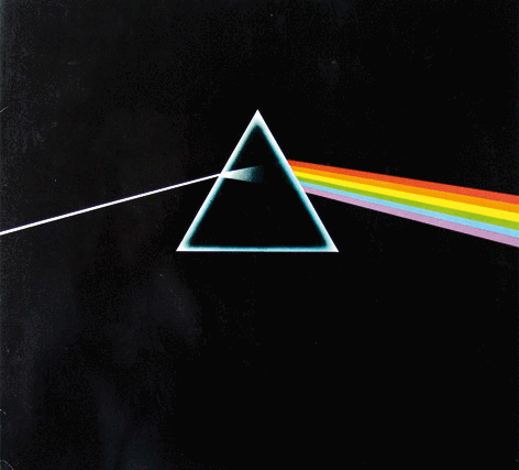
Pink Floyd “The Darkside of The Mooon” by Hypgnosis
own works:
Kaos - Hello Stranger
Skism - Swingset Fiasco


JAMES JARVIS
My favourite things change all the time so this list about my fav record covers is not definitive.
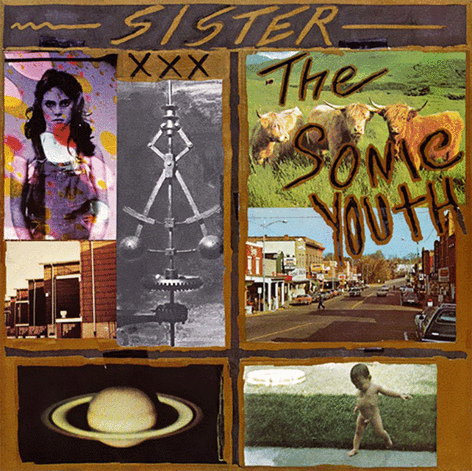
Sonic Youth “Sister”
Neu “Neu”
The Beatles “Revolver”
Top Three Designers: 1. Gary Panter 2. eYe 3. Raymond Pettibon
I would pick ‘Sister’. I was really into the Sonic Youth aesthetic when it came out in 1987. I don’t know who designed it, but I remember that it originally featured a Richard Avedon photo which they were forced to cover up. I thought it was really mystical. It reminds me of being 17, before I became a cynical realist.
JOSH PETHERICK
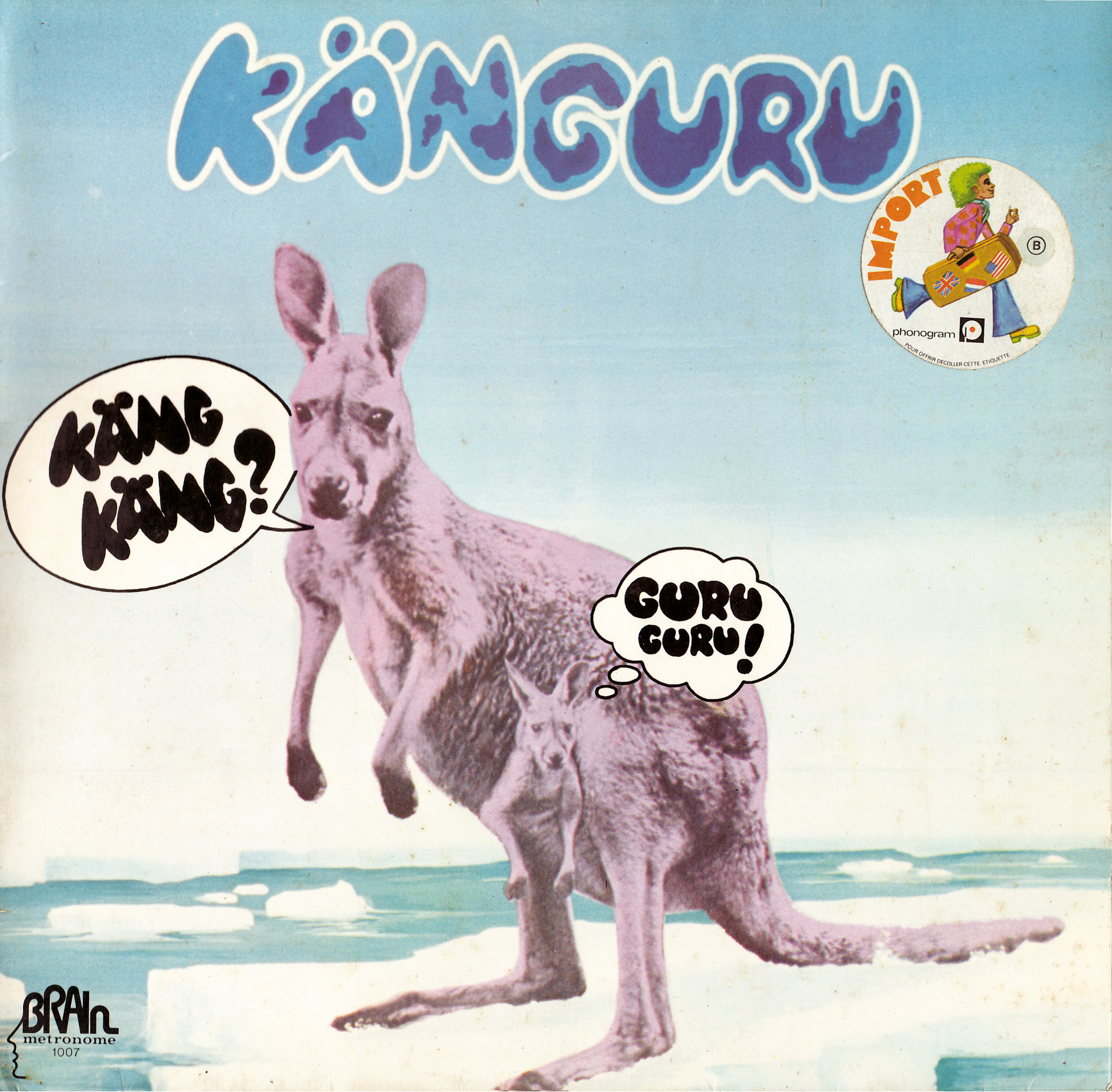
Guru Guru “Kanguru” (1972)
art director: Heinz Dofflein and Guru Guru
It’s not really my favourite, as I’m not one to actually have a favourite of anything, but a rather huge lists of favourites. Especially on a topic like record cover design. But for the sake of this article (and our Oz/German cross-over) I found this artwork appropriate. Um, yeah, but I’ve always loved the ridiculousness of this sleeve and couldn’t make a decision on a more seriously life-changing one (visually or musically). Others... I like Corky Mc Coy’s Miles Davis sleeves in the early 70’s. They are great records, too. Dinger and Rother’s art for their music projects (Neu!, La Dusseldorf, etc) is some of the finest graphic design EVER! The Father Yod / Ya Ho Wa 13 commune pressings are amazing. Yamatsuka Eye’s project covers. A zillion others. It is by far one of the most perfect vehicles for good, honest design because anything goes. And it’s exciting when, like a lot of the greatest music, “market” is of little concern. Especially in the heady days of vinyl private pressing and LP bootlegging. Actually, my first ever “real” graphic work was laying out hardcore Anarcho crust 7” sleeves for a record label here in Australia while I was in high school.
Text: Forty